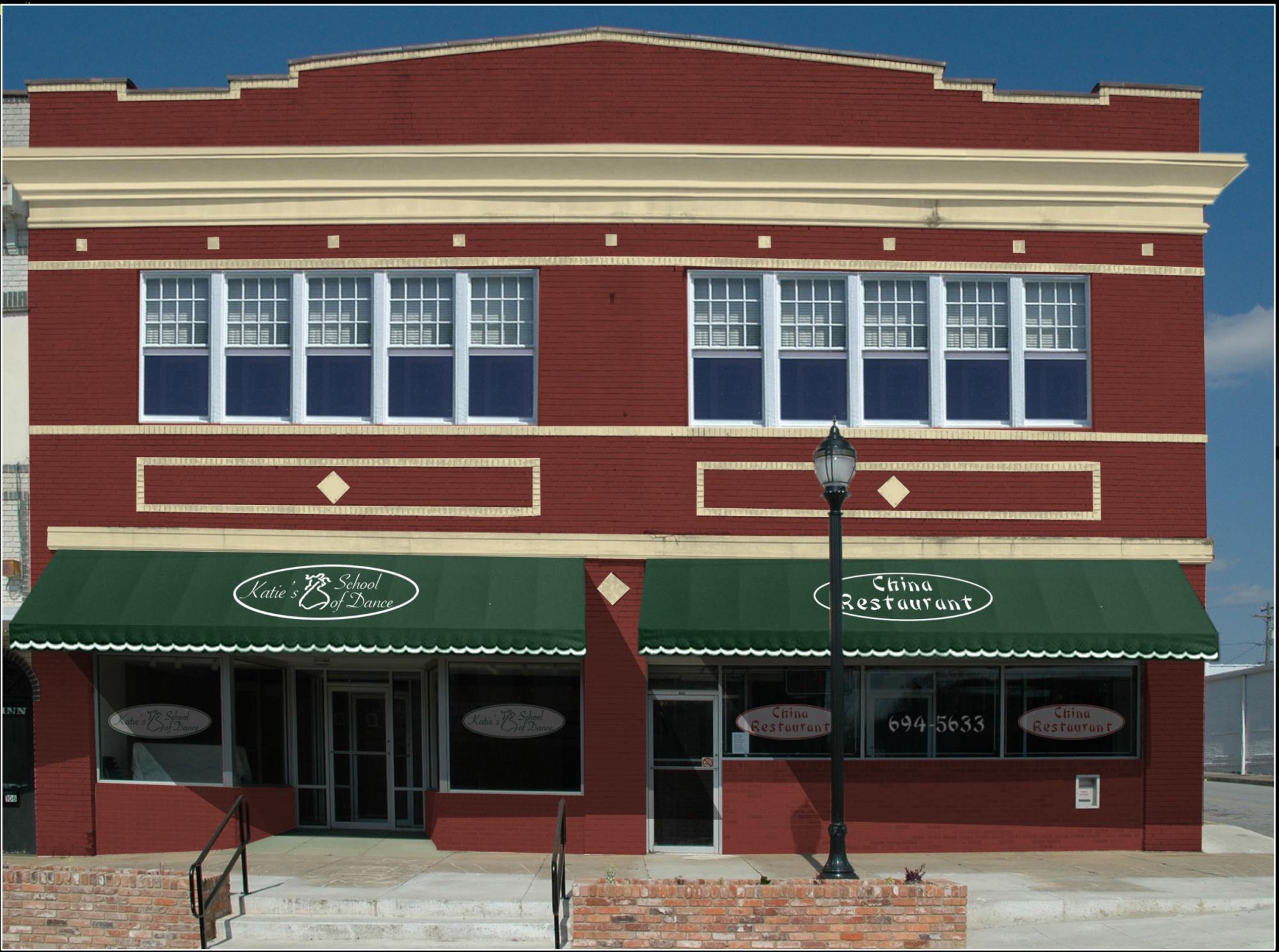
Randy Wilson, president of Community Design Solutions, begins his presentation on color theory for historic buildings by asking, “how many of you remember fondly — I assume it’s going to be elementary school — when you learned how to color in between the lines?”
The simplicity of selecting colors can make people dismissive of both the importance and logic involved in the process, but paint scheme choices can be a serious business. When a city or town regulates color choices in a district, paint choices can be a key part of the architectural review board decisions that directly impact economic development projects. Even when property owners don’t need official approval, they may consult their downtown development officials on color choices to ensure their projects will improve the overall appearance of a district.
Wilson presented the basics of color theory — something he describes as practical knowledge that uses comprehensible rules — to a recent gathering of the local directors of Main Street South Carolina, the state’s downtown development technical assistance program. When used properly, he said, color choices can dramatically enhance a tired-looking façade.
“Don’t underestimate the power of paint,” Wilson said.


Understanding color choices means understanding the color wheel — a diagram that shows how primary and secondary colors work together. Painting projects might use a monochromatic scheme featuring different hues of the same color, but complementary paint schemes use colors from opposite sides of the color wheel, while triadic schemes use visually compatible colors that form a triangle around the wheel.
“This isn't rocket science, these are just principles you need to know and tools you can use,” Wilson said. “It does pay to get it right, because once it's out there, it's out there — oftentimes for years — and you can't conceal it.”
Wilson said that one of the most counterintuitive pieces of advice he gives property owners is that if a brick building has never been painted, they should avoid painting it, since introducing paint to historic brick will create a maintenance issue that lasts for as long as the building stands. He also suggested that design committees could “gently give education” about the role of paint, especially when a building has more serious issues.
“Just because you paint the building, the mold’s not going to go away, the cracks aren’t going to go away. That is a symptom of a far greater and deeper issue — more times than not, water infiltration, or occasionally structural degradation,” he said.
Wilson said he also suggests that design review boards should avoid regulating color if possible. He added that those who set rules should preapprove a few color palettes created by major paint manufacturers to make things easier for both the city and the building owner.
“You basically have preapproved a couple of hundred colors, and if you can’t find an acceptable color [in that,] you’re probably trying too hard,” he said.
Beyond the color scheme of individual buildings, Wilson noted that color choices should consider whether the choices will resonate with the color of nearby buildings that are a part of the property’s larger “context.”
“What took almost a semester of architecture school to teach what they felt was important about context, I'm going to teach to you in 10 seconds,” he said. “’Context’ means you go to your building, and you look to the left, and you look to the right.”
In his early career, Wilson said he selected a particular yellow for a historic house, only to realize later that it clashed with its neighboring building, built in yellow brick.
Learn more about Main Street South Carolina online.
